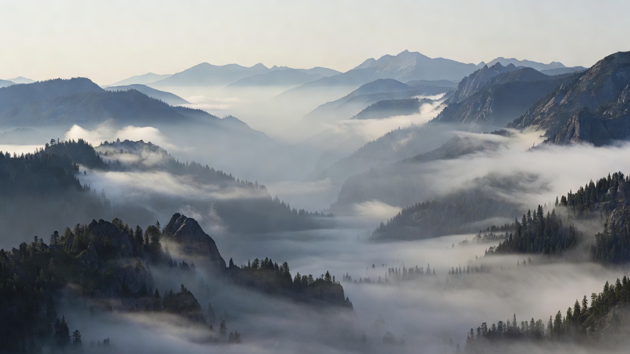
 Overlap + decreasing contrast = readable distance
Let the layers do the work
In a misty valley, successive ridges often become lighter and less contrasty as they recede. The overlapping silhouettes establish order; atmospheric differences reinforce it. If processing makes every ridge equally dark and crisp, the photograph may gain local drama while losing the very distance that made the scene compelling.
Begin by naming the largest masses rather than the landmarks. Look for a dark wedge, a pale interval and a middle-tone band. This temporary abstraction helps you see whether the picture holds before recognition supplies a familiar place name. A beautiful location is not a substitute for a readable arrangement.
Place the horizon according to the evidence
A low horizon gives the sky more responsibility. That works when cloud movement, light or open space contributes to the image. A high horizon makes the ground carry more detail and rhythm. A central horizon can create a deliberate equilibrium, particularly with reflections. The rule of thirds is one available test, not a requirement that overrides the scene.
Check what crosses the horizon. A distant person whose head merges into a ridge may lose legibility. A tree that almost touches a hill can create a distracting near-contact. Small changes in camera height can separate these shapes without changing the overall location. When the composition feels inexplicably awkward, inspect these meetings before replacing the whole frame.
Question the compulsory foreground
A nearby rock, branch or patch of grass can establish scale and create an entry point. It can also dominate the image simply because it is large and sharply rendered. Ask whether it relates to the distant subject. A curved shoreline that repeats a mountain’s slope has a structural role; a random boulder may be no more than a familiar landscape convention.
Empty ground is not automatically a fault. In Michael Kenna’s work, broad quiet areas often make small forms feel concentrated and deliberate. Ansel Adams’s photographs invite a different discussion about tonal placement and monumental structure. These approaches are useful comparisons because they pursue different visual aims, not because one supplies a universally superior recipe.
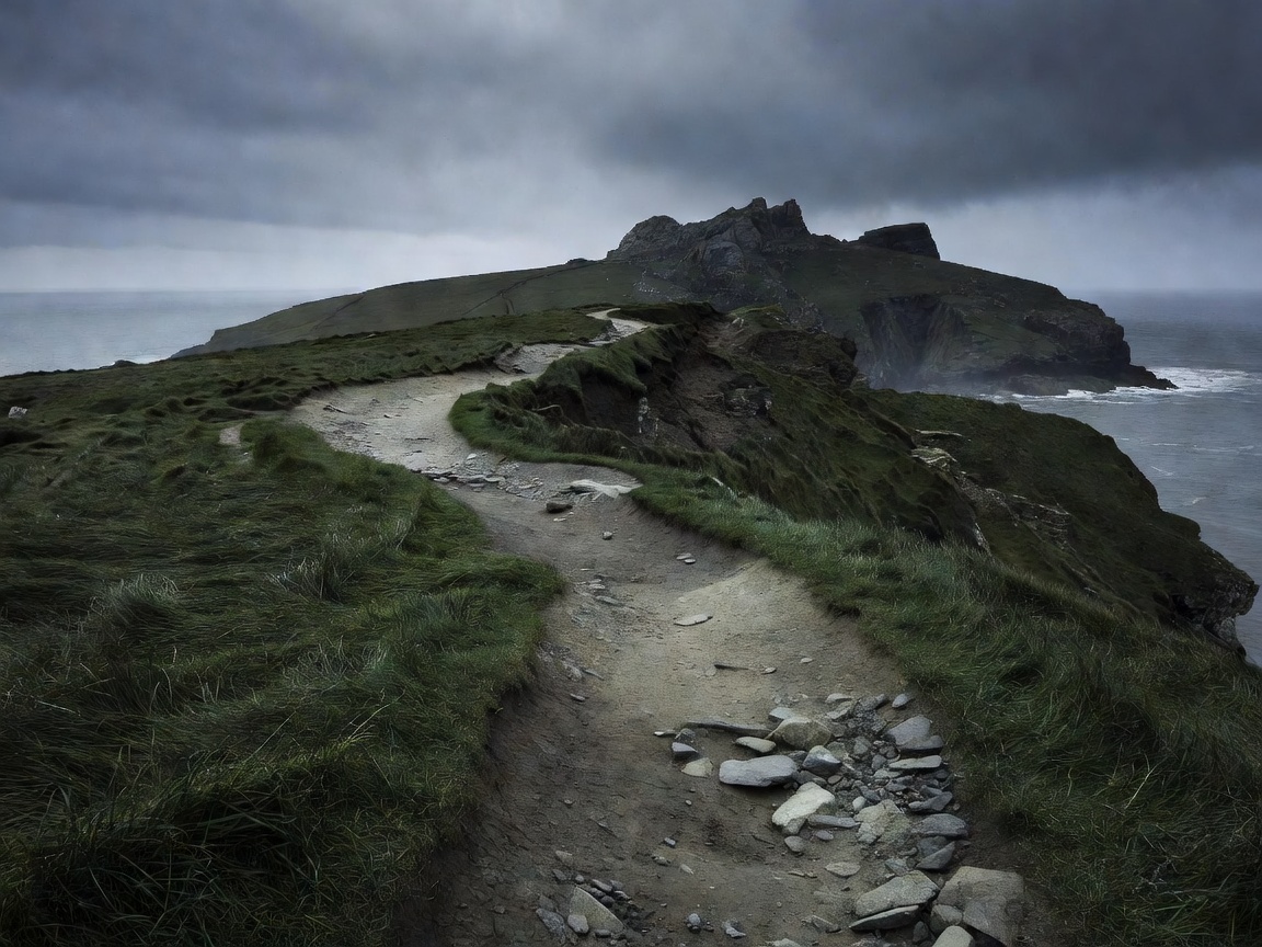 The path connects near texture to distant form
Use viewpoint to control scale
Lowering the camera increases the visual importance of nearby ground. Raising it may reveal a cleaner pattern of paths, fields or shoreline. Neither movement is merely technical. Each changes what the photograph claims matters. Try both before committing to the most immediately dramatic foreground.
A longer focal length can select a narrow section of distant forms. The commonly described “compression” depends on viewpoint: working farther away changes near-to-far size relationships, while the focal length determines the framing available from that position. Avoid attributing every spatial effect to the lens alone.
Separate weather from a promise of mood
Low cloud, rain and mist can simplify a scene or obscure its important structure. Clear midday light can produce harsh contrast, but it can also make graphic landforms wonderfully legible. Golden light is attractive, not obligatory. Start with what the conditions reveal and decide whether that supports the picture you want to make.
Locations such as Yosemite Valley, the Dolomites, Glencoe, the Lake District and the Namib Desert are frequently photographed because their forms offer strong visual material. Recognition can also encourage repetition. Study an unfamiliar interval, a quieter edge or a less obvious relationship instead of assuming that the established viewpoint is the only worthwhile one. Observe access rules and local protections wherever you work.
Compare landscape styles against a job
For explaining the shape of a place, layered naturalistic treatment may be the strongest option. For reducing a scene to rhythm, a minimal or monochrome approach can be more effective. For communicating weather and fleeting light, a more expressive treatment may be justified. Each sacrifices something: descriptive detail, colour evidence or neutrality. A useful ranking makes those trade-offs visible.
| Approach | Useful evidence | Watch for |
|---|---|---|
| Layered naturalism | Overlap and atmospheric gradation | Excess local contrast flattening distance |
| Minimal landscape | Isolated forms and clear spacing | Too little information to establish scale |
| Graphic monochrome | Tonal masses and repeating contours | Different colours collapsing to one tone |
When editing, preserve the tonal clues that explain distance. When critiquing, identify an actual overlap or size relationship rather than calling the scene “epic.” Specific language helps you repeat a successful decision somewhere less familiar.