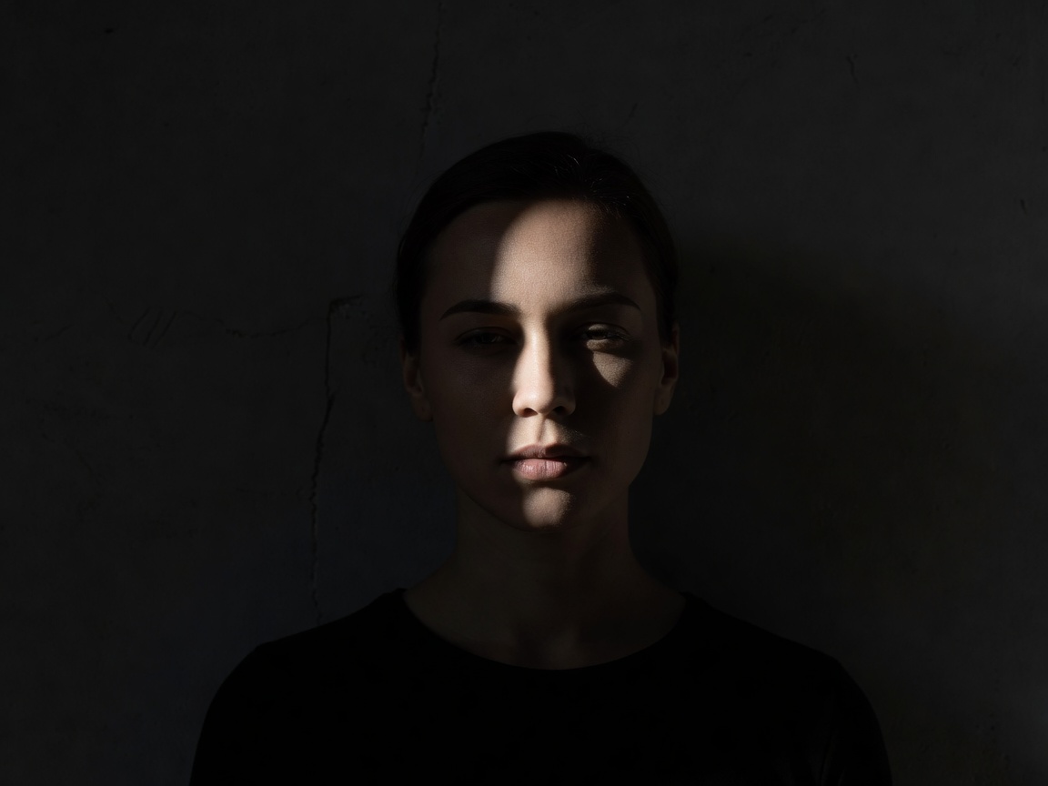
 Direction describes volume; contrast controls emphasis
Separate direction, softness and contrast
Light direction describes where illumination arrives from. Softness describes the transition at a shadow boundary. Contrast describes differences in brightness, including the relationship between lit and shadowed areas. These properties interact, but they are not interchangeable. A soft source can still produce deep shadows when there is little fill; a hard source can produce a relatively low-contrast scene when the surroundings return enough light.
The apparent size of a source relative to the subject is central to softness. A large nearby window can create gradual transitions. Direct sunlight, despite the sun’s physical size, acts as a relatively small apparent source and produces sharper shadows. Moving the subject, changing diffusion or introducing reflected light changes the result in different ways.
Read a lighting arrangement before copying it
Side light often makes volume visible because it places a transition across the subject. Front light can make surface information easier to inspect while reducing obvious modelling. Backlight can separate a contour from its surroundings, although the face may become much darker than the background. Choose according to the information you need, not a claim that one direction is always cinematic.
In a controlled portrait, make one change at a time. Move the source without changing the grade, then adjust fill without changing the source direction. If everything changes together, you cannot tell which decision improved the image. This same method works with a small still life or macro subject when a person is not available.
Give colour a structural role
Colour can attract attention, connect separate objects or divide a frame into competing regions. Before grading, ask which of these jobs matters. A warm highlight against a quieter background may reinforce an existing subject. Applying warmth everywhere can remove the very distinction that made the highlight useful. A convincing grade is often selective in its effect even when the adjustment itself is global.
White balance establishes a starting interpretation of illumination; it is not a guarantee of perceptual neutrality under mixed light. Skin, fabric and foliage can respond differently to adjustments. Watch the important relationships instead of trying to make every region agree. When the photograph serves documentation, product description or reproduction, colour fidelity usually deserves greater priority than an expressive signature.
What this pair can—and cannot—show
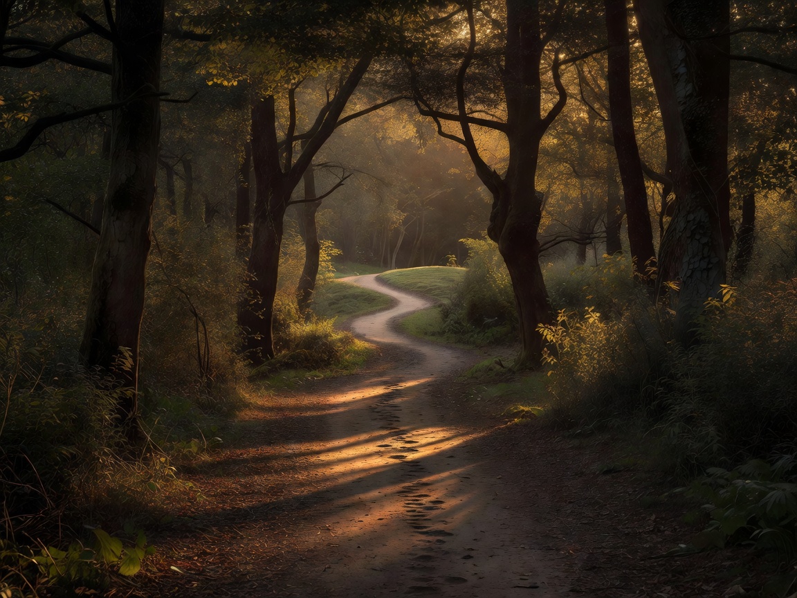
The comparison uses the same source photograph with two CSS display treatments. That keeps the crop, subject and timing identical. It demonstrates how warmth, saturation and contrast affect a reading, not a professional raw-development workflow. Your display, browser and ambient lighting also influence appearance. Neither version is evidence that the original scene looked this way.
The warm version may rank first for a welcoming editorial mood. The muted version may rank first for a study of repeating vertical forms. If the task were accurate botanical identification, neither stylised option would necessarily be the best choice. Keep an untreated reference and revisit it after your eyes have adapted to the grade.
Monochrome removes one language, not every distraction
Removing colour can clarify a structure when hues compete with gesture or form. It can also make differently coloured objects merge into the same grey. Check local tonal separation before declaring the conversion successful. A bright sign remains bright in monochrome, and a weak crop remains weak. The treatment changes the evidence available to the viewer; it does not automatically improve that evidence.
William Eggleston’s Guide and Saul Leiter’s colour work offer useful counterpoints to the assumption that seriousness requires monochrome. Their photographs encourage attention to colour relationships, obstructions and ordinary surfaces. Look at how colour operates inside each frame rather than copying a broad nostalgic palette.
A transparent style order
For a learning exercise whose goal is to diagnose framing and light, we place restrained naturalistic treatment first, muted colour second and strong expressive grading third. This is an order of diagnostic convenience, not artistic merit. A theatrical image might reverse it. High contrast, grain and pronounced colour shifts can be purposeful when they support the project and their departures from literal description are understood.
- 1Restrained naturalism / diagnostic clarity
Preserves more scene relationships. Still involves interpretive processing choices.
- 2Muted colour / shape emphasis
Reduces some competition. May erase meaningful colour distinctions.
- 3Expressive grading / authored mood
Can establish a strong visual voice. May obscure the original lighting relationships.